- Published by
- Helena Duppre
- Date
- Category
- ux
- Reading time
- 6 min
Too pretty to test: the aesthetic-usability effect
keywords: aesthetic-usability effect, ux, user research
A beautiful interface makes users like your product more. It also makes them give you a high ease-of-use score on a test where they just struggled through the task right in front of you. The aesthetic-usability effect is the most polite trap in user research.
In the last post I said that beautiful things work better. I still think so. What I left out was the dirty side of that story: beautiful also fools whoever is running the research. And sometimes that someone is you.
I've seen this scene a bunch of times in the testing room. The person opens the prototype, lets out a "wow, what a beautiful app", starts poking around, takes the wrong path, goes back, tries again, misses again, eventually gives up on the task I asked for, and still looks at me and says: "loved it, so easy". They didn't finish what I'd asked. And they swear it was smooth anyway. They're not lying to be polite. They actually believe it.
That gap between what a person does and what a person says has a name, has an age, and has a thirty-year-old study behind it.
Where does the aesthetic-usability effect come from?
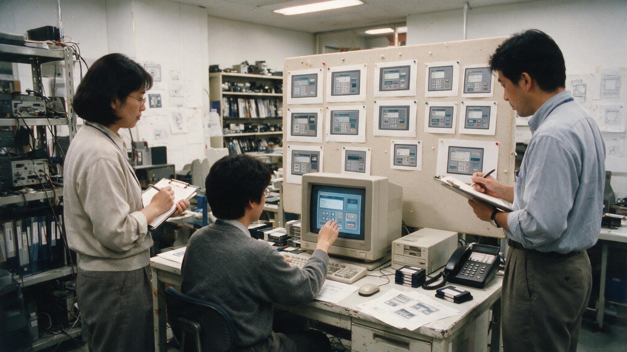
In 1995, two researchers at the Hitachi Design Center, Masaaki Kurosu and Kaori Kashimura, sat 252 people down in front of 26 different versions of an ATM screen. They asked two things: tell us how easy this interface looks to use, and tell us how beautiful it looks. Then they compared those answers against the ergonomic quality of each screen: key positions, grouping, operation sequence, all measured in the design itself. Nobody ever operated the ATM — what the study cross-checked was beauty ratings against layout best practice. The finding that turned the study into a classic: a screen's beauty tracked far more closely with perceived usability than with actual usability. In other words, how easy someone thought it would be depended more on the screen being pretty than on the screen working.
Kurosu and Kashimura named the two sides: apparent usability, which is how easy something looks, and inherent usability, which is how easy something is. The uncomfortable discovery is that we mix the two up all the time. We judge the second by looking at the first.
Then you think: okay, but that's a Japan thing, a country with a strong cultural relationship with aesthetics, care, detail. That's exactly what Noam Tractinsky thought. He redid the study in Israel, in 1997, expecting this link between beauty and perceived ease to disappear, or at least weaken, in a culture he considered more direct and less concerned with appearance. The opposite happened. The link not only showed up, it came back stronger than in Japan. That put to rest the idea that this was some Japanese cultural quirk. Beauty messes with anyone's perception of ease.
This phenomenon got a proper name, the aesthetic-usability effect, coined in Universal Principles of Design (Lidwell, Holden and Butler), and it reached most of us through Kate Moran's writing at the Nielsen Norman Group. The underlying explanation is almost disappointing in how simple it is: a beautiful interface triggers a good emotional reaction right away, and that first impression turns into credit. The person starts the experience already willing to like it. A small error becomes a forgivable detail. Friction becomes "ah, must be me". Beauty buys patience.
Why does it get in the way of usability testing?
In the real world, that patience is a gift. Fact. A product users find beautiful earns room to slip up, time to improve, forgiveness when it stalls. Every product team wants that credit in the bank.
Now flip it around. You're not in the real world, you're in a testing room, and your job there is the opposite of earning forgiveness: it's hunting for problems so you can fix them. The aesthetic-usability effect does exactly the opposite of what you need. It hides the problem under the varnish. That gorgeous prototype you polished in Figma, with the crisp shadow, the microinteraction, the tidy palette, it inflates your scores. The person fails right in front of you and still hands you a nine out of ten on ease. If you only listen to the score, you go home thinking everything is solved. And it isn't.
That's where the trap sits for anyone doing research: the prettier the material you bring to the test, the fewer problems show up in what the participant says and in the score they give — even with all of them still there, and even with you watching every one of them happen on screen. The problem count doesn't change; the account of it does. There is a measure for that gap, and it is harsher than what usually gets quoted. Jeff Sauro and James Lewis crossed the metrics of 90 usability tests and found this: when you ask about the task the person just finished, satisfaction and performance still track each other reasonably well. When you ask at the end of the session, about the whole experience, the correlation collapses to somewhere between 0.16 and 0.24. Which means the question almost everyone asks, the one at the end, is precisely the one least connected to what happened on screen.
How not to get fooled in a test
Take note:
- Watch what the person does, don't stop at what they say. The hand and the mouth disagreeing is the most valuable data in the whole session. If they got stuck three times and said it was easy, believe the hand.
- Measure hard things, not just feelings. Task completed or not, how long it took, how many times they backtracked. That "on a scale of 0 to 10, how easy was it?" is precisely the question most contaminated by beauty.
- Be suspicious of praise on a polished prototype, especially early in the project. A high score too soon is usually aesthetics talking, not usability.
- Test rough when you can. A colorless wireframe, low fidelity, the bare skeleton of the screen. With no varnish, the problem has nowhere to hide. Testing in low fidelity is research hygiene, not a sign of an unfinished project.
How far does the effect go?
One caveat so nobody walks away with the wrong idea: the effect has a boundary, and the boundary is use. Beauty weighs heavily on first impressions, and that is exactly what the 1995 and 1997 studies measured. When someone actually uses the thing and the task breaks, the ease score doesn't survive: Tuch and colleagues, in 2012, manipulated both the beauty and the usability of an online shop and watched aesthetics stop explaining perceived usability — and more, the interface came to be rated as less beautiful after the bad experience. The "beauty forgives a small stumble" I use above comes from the Nielsen Norman Group's session observations, not from an experiment. And there is a more recent review that tightens the net further: in 2023, a group reran the experiment controlling for processing fluency — how easily the eye processes an image before any judgement — and much of the effect vanished. The honest reading is that part of what we call "pretty looks easier" is really "easy to look at looks easy to use", which is not the same thing, and not what usually gets sold. Nobody is telling you to make the product ugly, quite the contrary. Beauty is a real advantage, the last post is entirely about that. What I'm saying is: don't let beauty answer a question it can't answer, which is whether the thing actually works.
Separating those two measures, how easy it looks and how easy it is, is half the job of anyone who researches interfaces. Kurosu and Kashimura had already figured that out back in 1995, in front of an ATM. We just have to remember it every time a user smiles and says they loved it.
A kiss, and see you next time!
The cover of this post is an AI-generated image, a recreation of the original 1995 study at the Hitachi Design Center. It is not the actual photo of the study.
References
- Kurosu, M. & Kashimura, K. (1995). Apparent usability vs. inherent usability: experimental analysis on the determinants of the apparent usability. CHI '95. The original ATM study (download the PDF on ACM).
- Tractinsky, N. (1997). Aesthetics and apparent usability: empirically assessing cultural and methodological issues. CHI '97. The Israel replication, which came back stronger than expected.
- Lidwell, W., Holden, K. & Butler, J. (2003). Universal Principles of Design. Where the aesthetic-usability effect shows up under that name.
- Moran, K. The Aesthetic-Usability Effect. Nielsen Norman Group (nngroup.com/articles/aesthetic-usability-effect). The piece that popularized the term and the warning for research.
- Sauro, J. & Lewis, J. R. (2009). Correlations among prototypical usability metrics: evidence for the construct of usability. CHI '09. The correlations across 90 tests: strong when the question is about the task (r between .44 and .60), weak when it is about the whole session (r between .16 and .24).
- Preßler, J. et al. (2023). Statistically Controlling for Processing Fluency Reduces the Aesthetic-Usability Effect. CHI '23. Reruns the experiment discounting processing fluency, and the effect shrinks a lot.
- Tuch, A. N., Roth, S. P., Hornbæk, K., Opwis, K. & Bargas-Avila, J. A. (2012). Is beautiful really usable? Toward understanding the relation between usability, aesthetics, and affect in HCI. Computers in Human Behavior. The experiment that manipulated beauty and usability together and found the relation reversed after use.
- Sauer, J., Seibel, K. & Rüttinger, B. (2010). The influence of user expertise and prototype fidelity in usability tests. Applied Ergonomics. One of the studies showing that prototype fidelity does not change the number of problems found.
- Norman, D. (2004). Emotional Design: Why We Love (or Hate) Everyday Things. The backdrop for the last post.
Read next
Synthetic users get the average right and lose the difference between people
A client wrote that he only used the app to check his balance, because it didn't feel safe enough to move money. That one sentence changed the priority of an entire project, and the app's store rating went from 3.5 to 4.7. A conversation about what synthetic users give you, what they have no way of giving you, and the test I use to decide where they belong.
9 min read
Why you love one app and hate another (even when they do the same thing)
I'm paying off the promise from my last post: emotional design. Don Norman's three levels explain why we decide we like a product long before we understand it.
4 min read
Heads up: UX and UI design aren't the same thing — but they go hand in hand
UX and UI aren't the same role. Practical differences, where job posts blur the lines, and why both disciplines work together in product design.
3 min read
loading comments...