Genial Investimentos: 709 responses before the first screen
- Period
- 2019–2020
- Disciplines
- UX Research, UX/UI, Design System
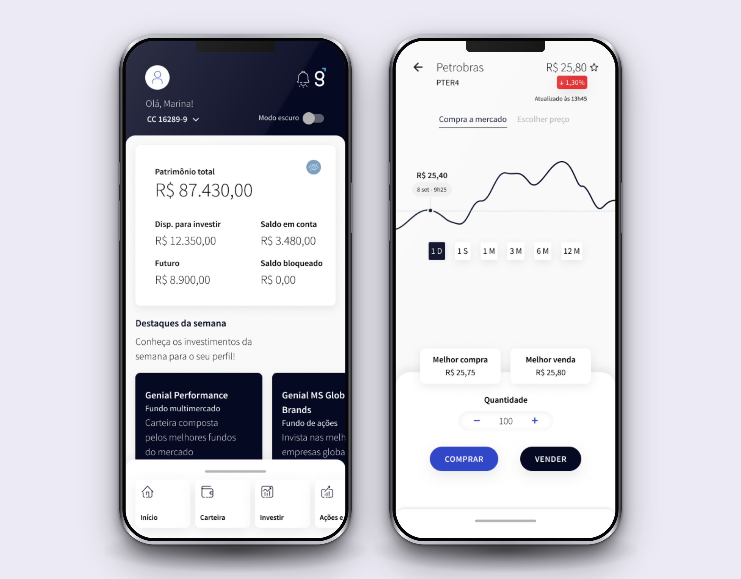
This case is a snapshot of 2019 and 2020. The Genial of today is not the one described here, and neither are the screens.
In 2019 Genial Investimentos had a problem that looked good on the report and bad in the till. New client signups grew month over month, and the money didn't come with them. People opened an account and stopped there.
I started this project as a mid-level designer and was promoted to senior halfway through it.
What was happening in the market
Brazilians were moving money out of the big banks, the profile of who invested was changing, and traditional brokerages had gone all in on digitizing their services. The investor arriving at that moment expected autonomy and self-service, which a brokerage built on an old structure doesn't deliver by giving the website a new face.
There was one more complication, and it explains much of what came after. The house came from an earlier brand, Geração Futuro, and the migration of the client base was still under way. In practice, the old app and the new one lived side by side in the stores. Anyone opening the new one had the old one a tap away, serving as a ruler.
The challenge
There were two objectives, and they explain why this started with a diagnosis instead of a straight redesign. The first was to convert signups: to get the person who opened an account all the way to the end, with money in it. The second was to make the app the clients' main platform.
The second one isn't solved with a prettier screen, because what was at stake was habit. People already had a way of using Genial, and that way went through the desktop. Changing it meant first understanding why the phone had been left with the secondary role.
The scope was the logged-in area, app and web, focused on account opening and on the investor in funds, fixed income, government bonds and pension plans. The home broker, the retail trading platform, wasn't the target of this phase. That choice had a consequence, and I come back to it at the end.
The rules the sector imposes
Brazil's financial market is one of the most heavily regulated there is, and the regulation doesn't stay with the lawyers: it comes down to the screen. ICVM 505 and 380, CMN Resolutions 4,557 and 2,554, Complementary Law 105. Translated into interface, that became a six-digit passcode, a lockout on the fifth attempt, mandatory two-factor authentication, an audit trail kept for five years and 256-bit encrypted traffic.
One client wrote in my survey that a six-digit passcode felt too weak for an investment platform, and that he would feel safer if he could use letters and symbols. He was right, and I couldn't do anything about it. The rule required exactly what he found unsafe.
For the signup flow I went to look at how the market did it: nine digital banks and seven brokerages. Average signup time was 11.5 minutes at the brokerages and 13 minutes at the digital banks, across an average of 30 to 32 screens. Three things came out of that sweep. Fewer fields per screen are better accepted. The perceived weight of the flow matters more than the number of screens. And the more it is broken into phases, the better.
709 responses
I wrote and ran the survey with the client base, plus a second internal round with the team. 709 responses came back.
Almost half the base used both platforms, 45.8%. Another 38.8% used only the website and 15.4% only the app. On investment knowledge, most declared themselves intermediate, 45.7%, followed by beginner, 34.7%. Advanced was a minority, 17.9%.
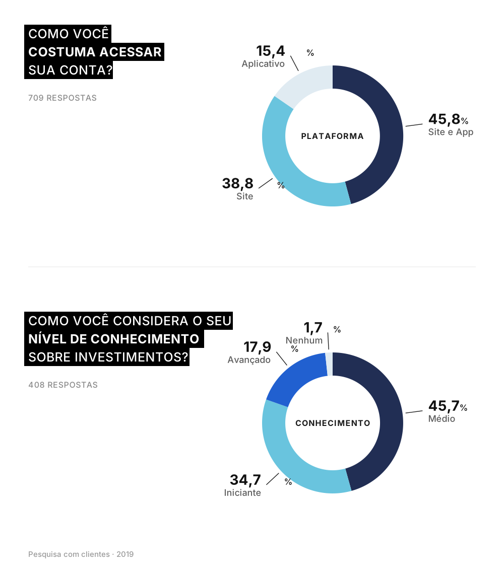
That second number mattered as much as the first. The platform served people who were still learning, and designing for someone who already knows how to trade would have been designing for the minority.
The number that reorganized the project was preference, answered by the 325 clients who used both platforms. I asked where the person preferred to do each thing. The website took investing with 85%, finding new investments with 86%, downloading statements with 81% and withdrawing with 71%. The app took checking balance and positions with 73%, and was in a technical tie on checking transactions, at 52%.
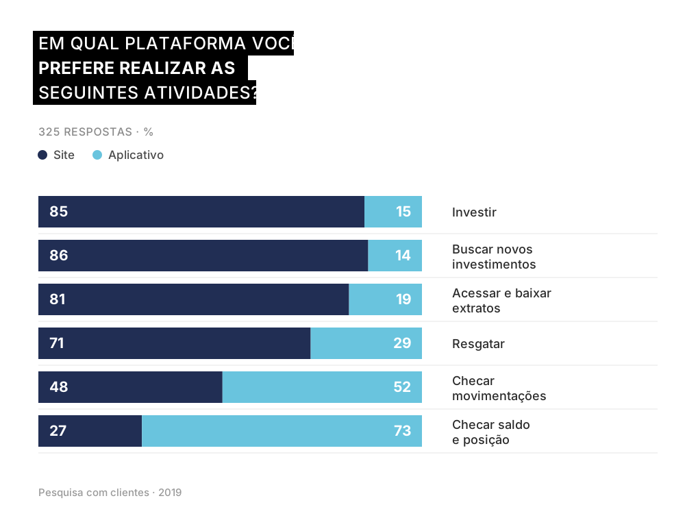
The app was the shop window and the website was the till. People used the phone to look, and went to the computer when it was time to touch the money.
The second half of that question is what closed the diagnosis, and it went against what I expected. I asked which of the two platforms was better on each attribute, and the app won exactly where I imagined it was weak: 71% found it more practical and 63% found it faster. What it lost was something else. The website was considered more complete by 96%, easier to understand by 91% and safer by 66%.
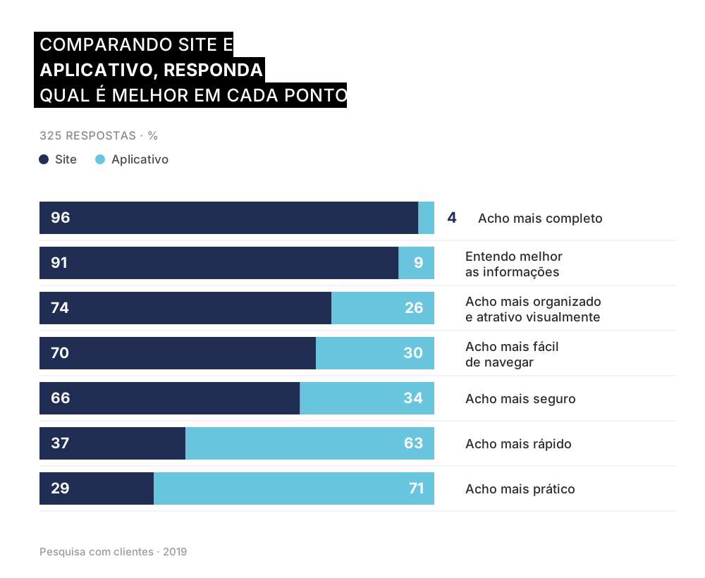
What the app lacked was trust. It was already the more convenient path and people chose the computer anyway, because there they understood what they were looking at and felt they were safe. For the app to become the main platform, it had to win those three, and none of them is solved by making the screen prettier.
In the open answers this came through in plain words. Someone wrote that they liked the platform a lot, didn't like the app as much, but found the app simpler for checking and withdrawing. Another summed up the diagnosis better than I did: the app is easier for someone already familiar with it, the website is more complete for someone after detail.
The three problems
I closed the research with three named problems, and I worked all three as hypotheses rather than certainties.
The first is that people didn't feel safe using the app. My hypothesis was that this feeling came from the visual language rather than from an actual security flaw.
The second is that they had no habit of moving money through the app, and went back to the web when it was time to invest.
The third is that the app's usability scored badly. Even people who found the app more practical said it was confusing and that the information was poorly distributed.
Out of those three came the two challenges I declared to the team: equalize the experience between website and app, so the journey would be the same on both, and encourage use of the app for transactions. The second one is the project's objective written as a design task.
The principles came before the screens
Before drawing anything, I wrote the guidelines that would drive the decision when it got hard: simplicity in visual and in language, consistency tied to the style guide, fewer clicks, accessibility, fluidity and predominant use of white.
White had two reasons. One is contrast and legibility. The other is that the system had to run white label, under the brands of partner banks and brokerages, and a light base gave far more control over that behavior than a colored base.
I built the design guidelines, the style guide and the library before the screens: tokens, grid, typography, icons and components. The app and the web came out of the same system instead of becoming two similar-looking products, and it was that library that made white label viable without redrawing everything for each partner.
What each screen decision was answering
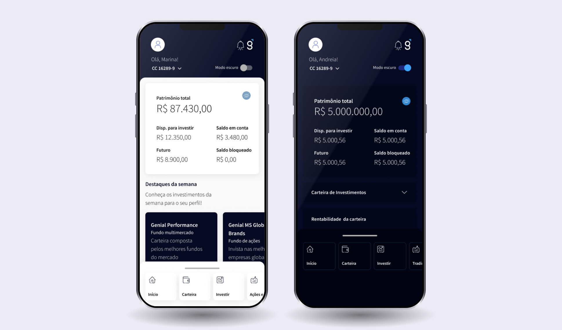
Account information was born suppressed, with the value hidden by default. That was the direct answer to the first problem: if the insecurity came from the visual reading, hiding the balance by default gave the user back the feeling of control.
The menu became a carousel to shorten click distance, and it was made customizable, with the person choosing what to keep within reach.
The backdrop summary brought to the first layer what the research pointed to as most relevant. Portfolio growth and portfolio returns went in because those were the most repeated requests in the open answers.
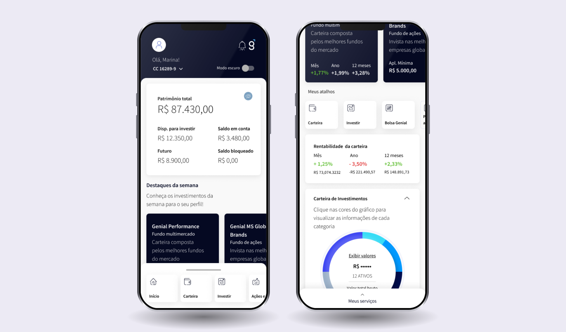
The whole home screen, top to bottom, has the order the research asked for. Net worth comes first, with the hide icon next to it. Then the week's highlights, the strip of shortcuts the person arranges however they want, portfolio returns over a month, a year and twelve months, and the portfolio chart by category. In the chart, the values appear masked with a "show values" in the middle: the same security decision, applied to the most sensitive data on the screen.
The empty state as a real screen
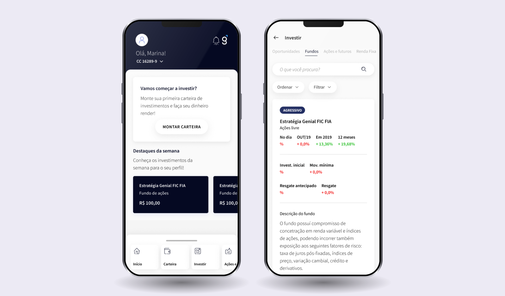
Someone who has never invested doesn't open the app on a full screen. They open it on an empty one, and that is the first impression the person gets of the product. I treated the empty state with the same care as the screens with content: instead of showing zeros, it invites and says what the next step is.
On the catalog side, the answer to the insight that people weren't investing because they felt unsure about their own knowledge: each fund carries the badge of the profile it matches, returns over four windows, the entry amount, the minimum transaction and the withdrawal rules, along with a description of what it does in plain Portuguese. Someone who already knows what they want has search, sorting and filters. Someone who doesn't comes in through the opportunities tab and doesn't need to know the name of anything to start.
The onboarding, and the decision research didn't make
Account opening became its own workstream: unify the brokerage signup and the digital account signup, with the fewest possible fields.
I designed two hypotheses. In one, the signup went through in a single stretch. In the other, it was split into parts, with the ID document and the selfie asked for only at the end, because the suspicion was that people felt intruded upon handing that over right away. I tested both with potential clients, half of them with no brokerage account at all, and the research didn't decide: it came out 50% for each, an exact tie.
The tiebreaker came from outside design, from a marketing figure the house already had: past the first two steps, drop-off fell to 3 to 5%. We split the signup into parts, and the document was left for the end.
That round brought the most useful insight of the whole project, and it had nothing to do with screens. People weren't failing to invest for lack of product. They were failing because they had no time to study and didn't feel secure about their own knowledge. And they didn't see the brokerage as a path to the things they actually wanted, like buying a house, changing cars or opening a business.
The process, and not just the product
In the middle of this I also designed how Genial would create product from then on. Three tracks came out of it, with stages, deliverables, duration and who joins at each phase: new product, at four and a half months plus three of follow-up; existing product, at three weeks; and a request arriving fully formed from the business area, at ten days. Each track named where UX, UI, product, business, IT, compliance and legal come in, and I left the material in an internal toolbox for the team to consult without depending on me.
I also presented internally on the difference between UX and UI, because part of the day-to-day friction came from the house never having agreed on what each role did.
I was mid-level when I started this.
The launch, and the bill that came with it
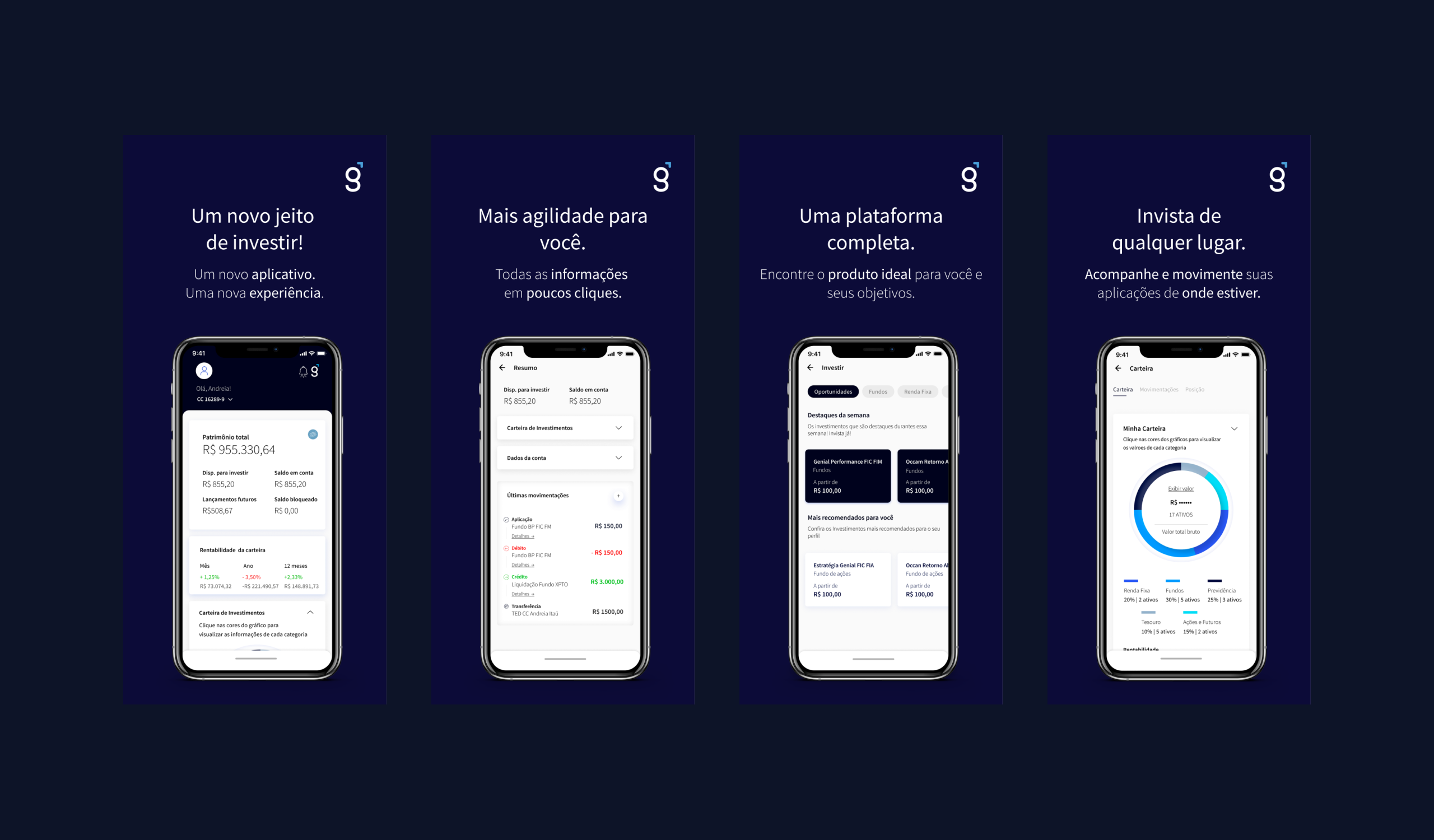
The app went to the stores in June 2020. I also made the store listing pieces for both stores, with the screens inside the device and one sentence per piece, which is where the product introduces itself to someone who isn't a client yet.
I collected the App Store and Play Store comments in July and kept them in a folder I called action plan, because that is what they were.
The reception split down the middle, and both halves were right.
People who used it to follow their investments approved. They wrote that it had become modern, simple and direct, that the essential information was highlighted, that portfolio returns and the recommendation showed up right away, that Face ID made life easier. One person said it was the best app among the country's brokerages.
People who traded disapproved, and always for the same reason. One summed it up like this: in the old one, everything that mattered was on the first screen, and now you had to hunt each piece of information across tab after tab. Another wrote that looks aren't everything. Plenty of people asked where the brokerage notes had gone and how to allocate margin for day trading.
That criticism is the bill for a decision we made with our eyes open. The focus of that phase was account opening and the fund investor, who was most of the base and the audience the company wanted to win. The active trader was a minority, and was left for later. They were served next, with Trading light.
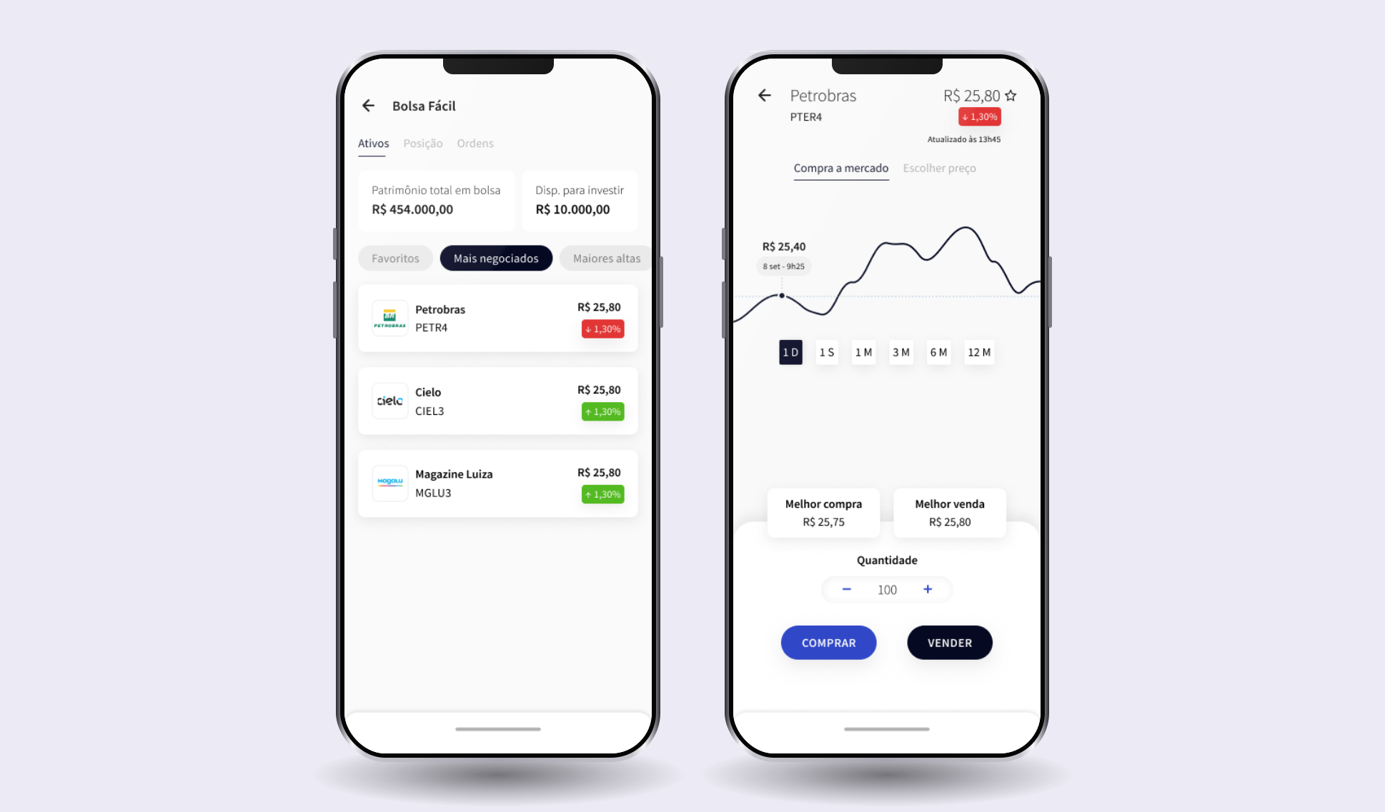
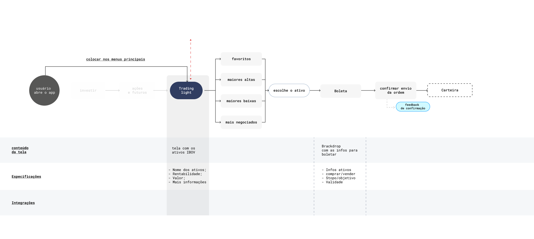
The Trading light design answers the complaint instead of working around it. In the flow, the two steps that used to exist before trading, invest and then stocks and futures, appear dimmed, and an arrow over the path leads straight from opening the app to the product, with the note I left for the team: put it in the main menus. Whoever complained about hunting information across tabs got the shortest path there was. Each step of the flow came with the screen's content, the specification and the integrations, so the development team wouldn't have to guess.
One of my decisions charged a direct price, and it is fair to record it. The value suppressed by default, which answered the insecurity problem, became an annoyance for people who opened the app several times a day and had to reveal the balance every time. The same choice that welcomed one user got in the other's way.
Dark theme was requested in July. The first version of dark mode is from August.
And there was the comment that closes the circle: one person reported the problems in the store, got a reply, saw everything fixed and changed their rating from one star to five.
The result
The app's rating went from 3.5 to 4.7, the highest among competing brokerages in the stores. The account opening targets were hit.
Revisiting the screens six years later
I wrote accessibility as a principle of the project in 2019, alongside simplicity and consistency. Before publishing this case, I went to measure whether the principle had made it to the screen.
Part of it did. Contrast on reading text passes AA comfortably on the screens I tested, and the use of white as a base, which at the time I justified by legibility and by white label, is what holds that number up.
What slipped through was the inactive state. The unselected tab on the order ticket has a contrast of 2 to 1, when the minimum is 4.5. It is the classic mistake of treating disabled as light grey without doing the math, and it still ships in new product today.
I didn't go back to fix the screens, because this case is the record of what existed in 2020. I'd rather leave a note about what I would see differently now.
What I learned
That researching and listening to the user is always the best path, and it is what brings the best result. I already believed that when I joined. The difference is that here I saw the thing close end to end: the research showed the app was used for looking and not for doing, the project was built on top of that, and the rating went up.
And that following the stages of a design project delivers real results. Here you could see the whole chain, stage by stage: it was the benchmark that gave me the acceptable signup time, it was the marketing figure that broke the tie when research came out even, and it was a store comment that became the next month's dark mode. Every stage I might have skipped would have become a decision made in the dark.
loading comments...